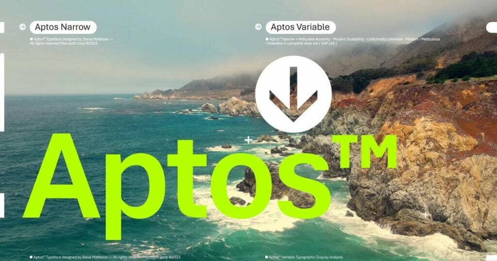
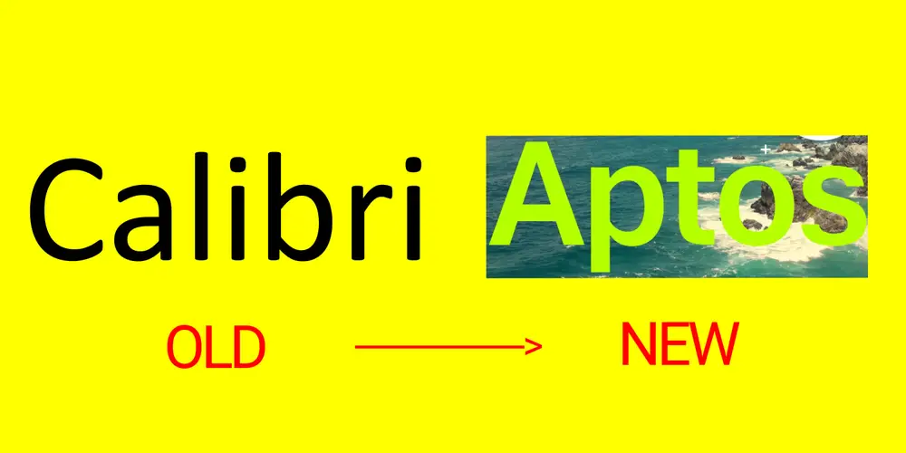
Microsoft’s new default font, Aptos, is a testament to the constant evolution in the realm of technology. This change signifies the tech giant’s response to the need for a font that caters to higher resolution screens and the changing needs of users, replacing Calibri after 15 years.
Table of Contents

Aptos is the creation of Steve Matteson, a renowned type designer whose portfolio includes the development of the original Windows TrueType core fonts and the creation of Segoe. The font is named after Matteson’s favorite town in Santa Cruz, California, embodying the font’s versatility and adaptability.
Microsoft’s New Default Font: The Transition from Calibri to Aptos
Microsoft’s journey to Aptos began with a quest for a new default font. The company commissioned five new fonts – Grandview, Seaford, Skeena, Tenorite, and Bierstadt (now known as Aptos) – and added them to the drop-down font picker in Microsoft 365. After gathering user feedback, Bierstadt, renamed Aptos, emerged as the new default font.

Aptos is the brainchild of Steve Matteson, a renowned type designer whose portfolio includes the development of the original Windows TrueType core fonts and the creation of Segoe. The font is named after Matteson’s favorite town in Santa Cruz, California, embodying the font’s versatility and adaptability.
What Makes Microsoft’s New Default Font, Aptos, Unique?
Aptos is a sans serif font, characterized by simple letterforms, even strokes, and easy readability. It is composed of varying geometric shapes, bold, well-defined, and constrained. The font supports many different languages and tones, and its different weights help set modes and direct the reader’s attention. Microsoft describes Aptos as embodying professionalism, adaptability, subtle flourishes of expression, and more clarity.
The transition to Aptos as the default font will be gradual, starting to appear in Word, Outlook, PowerPoint, and Excel for hundreds of millions of users. Over the next few months, it will roll out to be the default for all customers.

Microsoft’s Dedication to Evolution with the Introduction of Aptos
The introduction of Aptos is part of Microsoft’s broader wave of features coming to Microsoft 365, including a newly designed font picker experience, along with new themes, colors, and backgrounds. These updates are a testament to Microsoft’s commitment to its users, aiming to make the software more expressive and inclusive.
The change in default font is a part of Microsoft’s efforts to adapt to evolving technology, like higher resolution screens. The company believes that the font needed to have sharpness, uniformity, and be great for display type, which is why Aptos was chosen.
The Impact of Microsoft’s New Default Font, Aptos, on Users
The choice of a default font is more than just a design decision. It is often the first impression we make; it’s the visual identity we present to other people via our resumes, documents, or emails. As people and the world around us age and grow, so too should our modes of expression.
While Aptos is the new default, Microsoft encourages users to go beyond the default and choose the font that best suits their personal or professional needs. The choice of font can significantly impact the readability and overall aesthetic of your documents, so choose wisely!
For more insights into the world of design and typography, consider following my blogs here on my site where I delve into how these elements play a crucial role in shaping branding strategies on going.
In today’s digital age, the choice of typography can significantly impact a brand’s perception and recognition. By staying updated with our blogs, you’ll gain a deeper understanding of these nuances, helping you make informed decisions that can enhance your brand’s identity and resonance with your target audience. So, join us on this journey of exploration and discovery in the fascinating world of design and typography.

For more details on the new default font, you can read the full announcement on Microsoft’s official blog and Business Insider.

In conclusion, the introduction of Aptos as the new default font is a significant step in Microsoft’s journey of evolution and adaptation. It is a testament to the company’s commitment to its users and its dedication to staying at the forefront of technological advancements.


